Why a Bare Line Deserves Close Looking
Michael Leunig’s drawings routinely invite a casual misreading. At first glance, the line appears childlike or technically slight. This apparent simplicity prompts viewers to consume the image quickly before moving straight to the text. Close observation of his source log across three distinct career bands (1965-1979, 1980-1999, and 2000-2022) reveals a different reality. Contour, spacing, and posture perform immense heavy lifting.
We review these published cartoons, book collections, and poetry-image pages by focusing strictly on visual function rather than biography alone. Describing visual behaviours like wavering contours and open paper space proves far more useful than reconstructing full copyrighted panels. The bare line demands a slower, more deliberate kind of looking.
The Line as a Moral Instrument, Not a Shortcut
Consider a solitary figure drawn with wavering edges and thin, uneven ink pressure. This physical character of the mark feels as though the pen is thinking as it moves across the page. The apparent fragility establishes a broader principle: the line deliberately refuses heroic polish. Characters feel exposed rather than triumphant, standing vulnerable against the stark white background.
This economy operates as a strict technical choice. The line leaves out descriptive detail so that a slight tilt of the head, a slumped posture, or a sparse facial mark carries the emotional weight. A heavier, more confident stroke would destroy the delicate moral world these figures inhabit.
White Space, Pause, and the Tempo of the Page
What happens when we inspect the blank paper before reading the caption? Blank space functions actively in these compositions. It creates surrounding silence, groundless atmosphere, or visual isolation around a small object. Comparing layout effects across newspaper columns and open book pages shows how pacing shifts dramatically.
A spare image asks the reader to complete the emotional scene rather than passively consume a densely rendered punchline. The emptiness acts as a comic delay or a spiritual weather system.
Critical Insight: The appeal of the simple line lies less in what it describes than in the room it leaves for feeling.
Fragile Figures, Ducks, Moons, and Teapots
Recurring visual motifs serve as case-study material rather than a fixed symbolic code. Thin human figures, ducks, moons, teapots, paths, and domestic objects populate the frames across decades. Because Michael Leunig draws these elements lightly, they feel portable and emotionally available. They refuse to lock into a single realistic scene.
Yet, context dictates their ultimate function. A duck or a teapot shifts its tonal register—from tenderness and absurdity to melancholy, satire, or quiet dissent, depending entirely on its placement and the publication format. The same sparse vocabulary supports vastly different emotional outcomes.
What Simplicity Can Say — and Where It Strains
A dense topical caption paired with a sparse drawing often shifts the burden of meaning entirely to the text. The bare line cannot carry every complex public argument alone. This dynamic highlights where simplicity strains against its own boundaries. While a reduced aesthetic intensifies tenderness, it can simultaneously soften difficult subjects or overly distill nuanced debates.
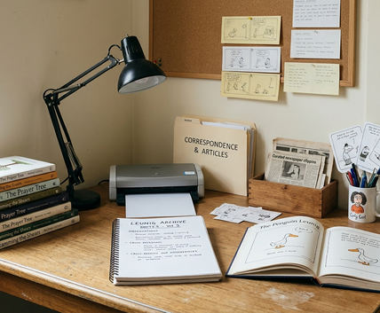
Ongoing archival review of Penguin Books Australia Ltd publications informs this analysis. While this visual review spans works from 1965 to 2022, these conclusions apply strictly to accessible cartoons, book pages, and poem-image pairings; they do not constitute a complete judgment on every caption or public statement across his career.
Risk Factor: A dense topical caption may depend more on verbal argument than on the bare line, meaning the drawing alone does not carry every intended meaning.
How to Read a Leunig Drawing More Slowly
How can readers and educators systematically unpack a sparse composition? A five-pass viewing sequence makes the act of looking teachable. First, describe the line. Next, map the empty space. Identify the posture, read the caption or poem, and finally articulate the emotional after-effect.
Comparing formats alters the force of these visual habits. A drawing that feels sharp in a 1970s newspaper column often reads as meditative when encountered in a later collection like State of Bewilderment.
Recommendation: Cover the caption for 10 to 20 seconds. Read the image silently, then uncover the text to record whether the words confirm, complicate, or overturn your initial impression.
Review Verdict: The Line Holds Because It Hesitates
The lasting appeal of this simple line comes directly from its hesitation. Reduced contour, open paper, small figures, and careful caption timing create force without heavy rendering.
Simplicity here is not the absence of technique. It represents a disciplined reduction that invites readers into uncertainty. By stripping away the unnecessary, the line makes small marks feel morally alert and deeply humane.