Encountering the Line Across Three Mediums
Place three manifestations of a single drawing by Michael Leunig side by side on a viewing table. You might arrange a broadsheet newspaper page, a spread from a printed collection, and a glowing digital archive image. The carrier dictates the encounter. Record what is physically present before interpreting the cartoon's emotional resonance. Note the carrier, visible page dimensions or pixel dimensions, crop status, colour mode, caption placement, signature visibility, and surrounding material. Conduct this initial three-version comparison in one 20–30 minute session so observations about scale, tone, and line weight happen under consistent viewing conditions. Working through all three in a single sitting tends to surface subtle shifts in tonal range and line integrity that sequential viewing obscures.
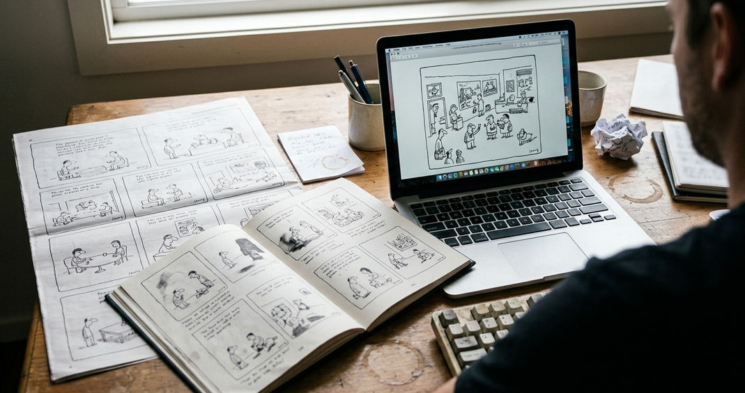
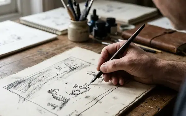
The goal remains an appreciation exercise rather than a hunt for one universally authentic format. Reproduction fundamentally alters what the reader notices. Dimensions, paper colour, neighbouring material, tonal range, crop boundaries, and visible line detail shift across these formats, changing the semiotic weight of every drawn element. A delicate, hesitant pen stroke on newsprint absorbs into the porous paper, softening its edges. That same stroke, reproduced on coated book stock, gains a crispness that may imply a decisiveness absent in the original execution. The digital scan introduces its own vocabulary of pixels and backlighting, transforming a physical mark into a luminous data point.
Reading the Surrounding Architecture of Print
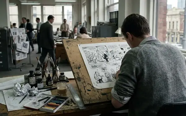
A newspaper supplies a dense historical and editorial architecture that frames the visual narrative. Read outward from the drawing: first the caption and border, then the adjacent column, headline, masthead, advertisements, and other cartoons sharing the page. A dated newspaper page can prove that a Leunig drawing and a headline circulated together. That neighbouring headline serves as a crucial anchor for cultural historians mapping the public mood of a specific morning. Their proximity cannot by itself prove the cartoonist's intended target. The layout editor, not the artist, often dictates the final juxtaposition of a whimsical figure against a grim political report.
Documenting the Print Context: A usable print citation requires the publication type, visible date, edition when stated, page number, book title and edition where relevant, the drawing's position on the page, and physical problems such as folds, foxing, tears, show-through, or trimmed margins.
Allow 5–10 minutes per printed version to inspect the full page before examining hesitant strokes, enclosed white areas, and dark passages at ordinary reading distance. Moving to a printed collection published by Penguin Books Australia, the experience shifts entirely. Books like State of Bewilderment offer a designed sequence. Cleaner reproduction and the presence of accompanying poems encourage slower, thematic reading. The editorial noise of the daily news cycle falls away, leaving the artwork to communicate within a curated, sustained narrative arc. The binding, the paper stock, and the isolation of the image on the page change the pacing of the read, inviting a contemplative engagement with recurring motifs.
Tracing the Pixelated Stroke in Digital Archives
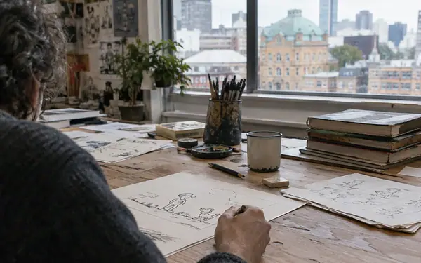
How does a screen alter the melancholy curve of a drawn figure? Digital access provides undeniable advantages for remote comparison, magnification, and placing versions side by side across vast geographical distances. Identifying the digital image's generation remains essential before judging the line. A capture of an original drawing behaves differently than a scan of newsprint, a photographed book page, or a microfilm-derived file. Following one Leunig stroke from newsprint to collection to scan means accounting for ink spread, page reduction, tonal correction, and pixel enlargement before interpreting its expressive force.
Record the repository description, stated source object, pixel dimensions, file format when exposed, colour or greyscale status, access date, visible borders, and any indication that the image came through an intermediate printed page. Compare the native display with a two-times enlargement during a 3–5 minute line inspection. Check curves, faint strokes, shadow blocks, and caption edges. Magnification itself should never be treated as added evidence. Tight crops often remove borders, compression roughens curves, and sharpening makes faint strokes look artificially decisive. Uneven capture can flatten paper tone, erasing the material history of the object and presenting a sterile, decontextualized graphic.
A Systematic Inspection Protocol for Archival Materials
A rigorous inspection sequence ensures interpretation does not outrun evidence. Begin by classifying the item: original, newspaper page, book page, microfilm-derived image, photograph, or unidentified file. Inspect the complete frame before interpreting details. Check whether signatures, captions, margins, ruled borders, page furniture, or parts of the drawing have been excluded. The compact record should contain seven fields: source description, publication or edition, visible date, crop status, image quality, surrounding material, and unresolved uncertainties.
A focused inspection takes 10–15 minutes per version. Dedicate 2–3 minutes for provenance and frame, 3–4 minutes for scale and line, 2–3 minutes for tone and surface, and 3–5 minutes for context and written uncertainties. Compare apparent scale and aspect ratio carefully. If dimensions are unavailable, use visible page elements cautiously and avoid claiming an exact original size. This assessment concerns observable reproduction conditions; it does not assume that Leunig directed every newspaper placement, collection-design choice, or subsequent digitisation decision. Acknowledging these limitations prevents the researcher from attributing editorial accidents to artistic intent.
Aligning the Format with the Interpretive Task
The final choice of format depends entirely on the interpretive task at hand. A complete newspaper page serves historical placement, anchoring the artwork in the specific cultural anxieties of its publication day. Sustained thematic reading is better served by a well-produced collection, which lets the viewer trace the evolution of recurring characters across a curated sequence. A documented digital copy facilitates access and cross-comparison, enabling rapid visual analysis across disparate archives.
Structuring Classroom Comparisons: A classroom comparison can pair one full-page newspaper image with one book or digital reproduction, reserving 10–20 minutes for students to identify differences in framing, line weight, white space, captions, and adjacent material.
When classroom observation depends on material evidence, pairing at least two forms works well. Researchers face a different burden of documentation. Record the access date on the day of consultation and preserve the file's displayed source description. Catalogue wording, available resolution, and interface crops frequently change between consultations. Preserve uncertainty in notes and quotations rather than silently treating a cropped or processed image as equivalent to the source object. The material history of the reproduction carries as much cultural data as the drawn line itself.
When you next encounter a familiar duck or teapot in a digital feed, will you accept the cropped, sharpened pixels at face value, or will you track down the newsprint page to see what the algorithm erased?